考え付いた事が次から次へと無駄になっていく日々です。 が、 とても勉強になり楽しくもあります。 (M じゃないハズ、、、)
ポジティブに考えればモバイルのみ考えれば良くなった。
PC に対応しない (not 出来ない) 言い訳もできた。
やるべき事は決まった。
、、、 よし、 行くか。
- カスタマイズは自己責任でお願いします。
- wp-cocoon.comサイトのサポート対象外となります。
モバイルファースト
モバイルのみの対応なので、 勉強の意味も込めてモバイルファーストで記述してみます。
準備編
今回の仕様
今回は次の様な仕様を目指します。
iPhone 縦持ち
- フォントサイズは16px
- 2・3カラムはラップ表示
- 4〜6カラムは疑似カラム表示
- Cocoon ブロックのレイアウト変更
iPhone 横向き
- フォントサイズは16px
- 2・3カラムはカラム表示
- 4〜6カラムは疑似カラム表示
iPad 縦向き
- フォントサイズは18px
- 2〜6カラムはカラム表示
iPad 横向き
- フォントサイズは18px
- 2〜6カラムはカラム表示
- サイドメニュー表示アリ
解像度ラインナップ
次の画面サイズでベタ組みを目指します。
| デバイス | たて | よこ |
| iPhone 5・ SE | 320 | 568 |
| iPhone 6・7・8 | 375 | 667 |
| iPhone 6・7・8 Plus | 414 | 736 |
| iPhone X・XS | 375 | 812 |
| iPhone XR・XS Max | 414 | 896 |
| iPad mini・iPad・iPad Pro (9.7) | 768 | 1024 |
| iPad Pro (10.5) | 834 | 1112 |
| iPad Pro (11) | 834 | 1194 |
| iPad Pro (12.9) | 1024 | 1366 |
「iPad mini・iPad・iPad Pro (9.7)」 のよこサイズと、 「iPad Pro (12.9)」 のたてサイズが同一なので、 今回のメディアクエリには 「orientation:」 を付加します。
基本設定
 //  コンテンツ幅
 $thx_main_column_contents_width: 320px;

 //  コンテンツの padding 幅
 $thx_main_column_contents_padding: 10px;

 // iPhone でのフォントサイズ
 $thx_iphone_font_size: 16px;

 // iPad でのフォントサイズ
 $thx_ipad_font_size: 18px;

 //  仕様フォントのコンデンス幅
 $thx_site_font_condense: 1;

 // iPhone でのフォント幅
 $thx_iphone_font_width:
   $thx_iphone_font_size * $thx_site_font_condense
 ;

 // iPad でのフォント幅
 $thx_ipad_font_width:
   $thx_ipad_font_size * $thx_site_font_condense
 ;

 //  デフォルトのフォント幅
 $thx_site_font_width: $thx_iphone_font_width;

 //  カラムの数
 $thx_beta_column_count: 1;

 //  カラム間マージン
 $thx_beta_column_margin:
   $thx_site_font_width * 2
 ;

 // 基本フォントファミリー
 $thx_font_family:
 //    "UD 新ゴ コンデンス 90 L",
     'Hiragino Sans',
     'Hiragino Kaku Gothic ProN',
     Meiryo,
     sans-serif
 ;

 // コンテンツ幅を文字幅の整数倍に
 $thx_main_column_contents_width:
   $thx_main_column_contents_width
   - ($thx_main_column_contents_width % $thx_site_font_width)
 ;

 //iPhone 縦持ち
 $iphone_sizes_p: 320,375,414;

 //iPhone 横向き
 $iphone_sizes_l: 568,667,736,812,896;

 //iPad 縦向き
 $ipad_sizes_p: 768,834;

 //iPad 横向き
$ipad_sizes_l: 1024,1112,1194,1366; いつもの通り、 まずは変数化です。
行数が増えてきたのでスクロールでご覧ください。
全体が見てみたい方は、 下記のファイル名ボタンからお願いします。
 //mixin 設定
 @mixin thx-beta-body {
   font-family: $thx_font_family;
 }

 @mixin thx-beta-p {
   text-align: justify;
 }

 @mixin thx-default-text-align {
   text-align: start;
 }

 @mixin thx-column-margin(
   $contents_width: $thx_main_column_contents_width,
   $font_width: $thx_site_font_width,
   $column_count: $thx_beta_column_count,
   $column_margin: $thx_beta_column_margin
 ) {
   $columns_margin_total: $column_margin * ($column_count - 1);
   $text_width: $contents_width - $columns_margin_total;
   $text_count: $text_width / $font_width;
   $text_width_rem: $text_count % $column_count;
   $text_width_rem: $text_width_rem * $font_width;
   $columns_margin_total: $columns_margin_total + $text_width_rem;
   $column_margin: $columns_margin_total / ($column_count - 1);
   margin-right: $column_margin;
 }

 @mixin secondary-box($font_width: $thx_site_font_width) {
   padding: $font_width;
 }

 @mixin blank-box($font_width: $thx_site_font_width) {
   margin-left: 0;
   margin-right: 0;
   border-width: 2px;
   padding-left: ($font_width - 2px);
   padding-right: ($font_width - 2px);
 }

 @mixin blank-box-sticky($font_width: $thx_site_font_width) {
   border-width: 0 0 0 ($font_width * 2);
   padding-left: $font_width;
   padding-right: $font_width;
 }

 @mixin common-icon-box($font_width: $thx_site_font_width) {
   border-width: 1px;
   padding-left: ($font_width * 4) - 1px;
   padding-right: $font_width - 1px;
 }

 @mixin toggle-checkbox($font_width: $thx_site_font_width) {
   border-width: 1px;
   padding-left: ($font_width - 1px);
   padding-right: ($font_width - 1px);
 }
続いて mixin 設定です。
初期設定は以上となります。
 //  コンテンツ幅
 $thx_main_column_contents_width: 320px;

 //  コンテンツの padding 幅
 $thx_main_column_contents_padding: 10px;

 // iPhone でのフォントサイズ
 $thx_iphone_font_size: 16px;

 // iPad でのフォントサイズ
 $thx_ipad_font_size: 18px;

 //  仕様フォントのコンデンス幅
 $thx_site_font_condense: 1;

 // iPhone でのフォント幅
 $thx_iphone_font_width:
   $thx_iphone_font_size * $thx_site_font_condense
 ;

 // iPad でのフォント幅
 $thx_ipad_font_width:
   $thx_ipad_font_size * $thx_site_font_condense
 ;

 //  デフォルトのフォント幅
 $thx_site_font_width: $thx_iphone_font_width;

 //  カラムの数
 $thx_beta_column_count: 1;

 //  カラム間マージン
 $thx_beta_column_margin:
   $thx_site_font_width * 2
 ;

 // 基本フォントファミリー
 $thx_font_family:
 //    "UD 新ゴ コンデンス 90 L",
     'Hiragino Sans',
     'Hiragino Kaku Gothic ProN',
     Meiryo,
     sans-serif
 ;

 // コンテンツ幅を文字幅の整数倍に
 $thx_main_column_contents_width:
   $thx_main_column_contents_width
   - ($thx_main_column_contents_width % $thx_site_font_width)
 ;

 //iPhone 縦持ち
 $iphone_sizes_p: 320,375,414;

 //iPhone 横向き
 $iphone_sizes_l: 568,667,736,812,896;

 //iPad 縦向き
 $ipad_sizes_p: 768,834;

 //iPad 横向き
$ipad_sizes_l: 1024,1112,1194,1366; // main: ../style.scss
/*********/
/* ベタ組 */
/*********/
@import "var_ios_betagumi";
//mixin 設定
@mixin thx-beta-body {
font-family: $thx_font_family;
}
@mixin thx-beta-p {
text-align: justify;
}
@mixin thx-default-text-align {
text-align: start;
}
@mixin thx-column-margin(
$contents_width: $thx_main_column_contents_width,
$font_width: $thx_site_font_width,
$column_count: $thx_beta_column_count,
$column_margin: $thx_beta_column_margin
) {
$columns_margin_total: $column_margin * ($column_count - 1);
$text_width: $contents_width - $columns_margin_total;
$text_count: $text_width / $font_width;
$text_width_rem: $text_count % $column_count;
$text_width_rem: $text_width_rem * $font_width;
$columns_margin_total: $columns_margin_total + $text_width_rem;
$column_margin: $columns_margin_total / ($column_count - 1);
margin-right: $column_margin;
}
@mixin secondary-box($font_width: $thx_site_font_width) {
padding: $font_width;
}
@mixin blank-box($font_width: $thx_site_font_width) {
margin-left: 0;
margin-right: 0;
border-width: 2px;
padding-left: ($font_width - 2px);
padding-right: ($font_width - 2px);
}
@mixin blank-box-sticky($font_width: $thx_site_font_width) {
border-width: 0 0 0 ($font_width * 2);
padding-left: $font_width;
padding-right: $font_width;
}
@mixin common-icon-box($font_width: $thx_site_font_width) {
border-width: 1px;
padding-left: ($font_width * 4) - 1px;
padding-right: $font_width - 1px;
}
@mixin toggle-checkbox($font_width: $thx_site_font_width) {
border-width: 1px;
padding-left: ($font_width - 1px);
padding-right: ($font_width - 1px);
}
@import "iphone_portrait";
@import "iphone_landscape";
@import "ipad_portrait";
@import "ipad_landscape";
@import "4-6columns"; iPhone 縦持ち
共通設定
 /*_/_/_/_/_/_/_/_/*/
 /* iPhone   縦持ち  */
 /*        共通設定  */
 /*_/_/_/_/_/_/_/_/*/
 @media screen and
   (max-width: 414px) and
   (orientation: portrait)
 {
   $font_width: $thx_iphone_font_width;
   .page-body {
     font-size: $font_width;
   }

   /*  案内ボックス  */
   .secondary-box {
     padding: $font_width;
   }

   /*  白抜きボックス  */
   .blank-box {
     border-width: 2px;
     padding-left: ($font_width - 2px);
     padding-right: ($font_width - 2px);
   }

   /*  付箋風ボックス  */
   .blank-box.sticky {
     border-width: 0 0 0 ($font_width * 1);
     padding-left: $font_width;
     padding-right: $font_width;
   }

   /*  アイコンボックス  */
   .common-icon-box {
     border-width: 1px;
     padding-left: ($font_width / 2) - 1px;
     padding-right: ($font_width / 2) - 1px;
   }

   /*  トグルボックス  */
   .toggle-checkbox:checked~.toggle-content {
     border-width: 1px;
     padding-left: ($font_width - 1px);
     padding-right: ($font_width - 1px);
   }
 }
画面サイズが 「414px 以下」 かつ、 「縦向き」 のメディアクエリです。
使用するフォントサイズと、 Cocoon ブロックのレイアウト変更を行います。
モバイルファーストを目指しながら、 いきなり 「max-width:」 を使うのはオカシイ気もしますが ;;
個別設定
 /*****************/
 /* iPhone  縦持ち  */
 /*       個別設定  */
 /*****************/
 @each $size in $iphone_sizes_p {
   $font_width: $thx_iphone_font_width;
   $contents_padding: $thx_main_column_contents_padding;
   // $contents_width を文字幅の整数倍に
   $contents_width:
     ($size - $contents_padding * 2)
     - (
       ($size - $contents_padding * 2)
       % $font_width
     )
   ;
   @media screen and
     (width: #{$size}px) and
     (orientation: portrait)
   {
     body {
       @include thx-beta-body;
     }
     p {
       @include thx-beta-p;
     }
     .no-scrollable-main .main {
       width: $contents_width + $contents_padding * 2;
       margin-left: auto;
       margin-right: auto;
       padding-left: $contents_padding;
       padding-right: $contents_padding;
     }
   }
 }
変数 「$iphone_sizes_p」 で与えられる画面サイズでループします。
「画面サイズ」・「フォント幅」・「padding 幅」 より、 フォント幅の整数倍になるコンテンツ幅を求めます。
カラムブロック
 /*_/_/_/_/_/_/_/_/*/
 /* iPhone   カラム  */
 /*        共通設定  */
 /*_/_/_/_/_/_/_/_/*/
 @media
   (max-width: 767px) and (orientation: portrait)
 {
   /*  2・3カラムはラップ表示  */
   .wp-block-columns.has-2-columns,
   .wp-block-columns.has-3-columns {
     flex-wrap: wrap;
     .wp-block-column {
       margin-left: 0px;
       margin-right: 0px;
     }
   }
 }

 @media
   (max-width: 767px) and (orientation: portrait),
   (max-width: 1023px) and (orientation: landscape)
 {
   /*  4・6カラムは疑似2カラム表示  */
   .wp-block-columns.has-4-columns,
   .wp-block-columns.has-6-columns {
     .wp-block-column {
       flex-basis: 50%;
       margin-left: 0px;
       margin-right: 0px;
       @include thx-default-text-align;
       &:nth-child(odd) {
         padding-right: ($thx_beta_column_margin / 2);
       }
       &:nth-child(even) {
         padding-left: ($thx_beta_column_margin / 2);
       }
     }
   }
   /*  5カラムは2 + 3カラム表示  */
   .wp-block-columns.has-5-columns {
     .wp-block-column {
       margin-left: 0px;
       margin-right: 0px;
       @include thx-default-text-align;
       &:nth-child(1) {
         flex-basis: (100%/2);
         padding-right: ($thx_beta_column_margin / 2);
       }
       &:nth-child(2) {
         flex-basis: (100%/2);
         padding-left: ($thx_beta_column_margin / 2);
       }
       &:nth-child(3) {
         flex-basis: (100%/3);
         padding-right: $thx_beta_column_margin * (2/3);
       }
       &:nth-child(4) {
         flex-basis: (100%/3);
         padding-left: $thx_beta_column_margin * (1/3);
         padding-right: $thx_beta_column_margin * (1/3);
       }
       &:nth-child(5) {
         flex-basis: (100%/3);
         padding-left: $thx_beta_column_margin * (2/3);
       }
     }
   }
 }
「2・3カラムはラップ表示」 のため、 「flex-wrap: wrap;」 とします。
「4〜6カラムは疑似カラム表示」 は 「iPhone 横向き」 と重複するので、 併せて記述しています。
 /*_/_/_/_/_/_/_/_/*/
 /* iPhone   縦持ち  */
 /*        共通設定  */
 /*_/_/_/_/_/_/_/_/*/
 @media screen and
   (max-width: 414px) and
   (orientation: portrait)
 {
   $font_width: $thx_iphone_font_width;
   .page-body {
     font-size: $font_width;
   }

   /*  案内ボックス  */
   .secondary-box {
     padding: $font_width;
   }

   /*  白抜きボックス  */
   .blank-box {
     border-width: 2px;
     padding-left: ($font_width - 2px);
     padding-right: ($font_width - 2px);
   }

   /*  付箋風ボックス  */
   .blank-box.sticky {
     border-width: 0 0 0 ($font_width * 1);
     padding-left: $font_width;
     padding-right: $font_width;
   }

   /*  アイコンボックス  */
   .common-icon-box {
     border-width: 1px;
     padding-left: ($font_width / 2) - 1px;
     padding-right: ($font_width / 2) - 1px;
   }

   /*  トグルボックス  */
   .toggle-checkbox:checked~.toggle-content {
     border-width: 1px;
     padding-left: ($font_width - 1px);
     padding-right: ($font_width - 1px);
   }
 }

 /*****************/
 /* iPhone  縦持ち  */
 /*       個別設定  */
 /*****************/
 @each $size in $iphone_sizes_p {
   $font_width: $thx_iphone_font_width;
   $contents_padding: $thx_main_column_contents_padding;
   // $contents_width を文字幅の整数倍に
   $contents_width:
     ($size - $contents_padding * 2)
     - (
       ($size - $contents_padding * 2)
       % $font_width
     )
   ;
   @media screen and
     (width: #{$size}px) and
     (orientation: portrait)
   {
     body {
       @include thx-beta-body;
     }
     p {
       @include thx-beta-p;
     }
     .no-scrollable-main .main {
       width: $contents_width + $contents_padding * 2;
       margin-left: auto;
       margin-right: auto;
       padding-left: $contents_padding;
       padding-right: $contents_padding;
     }
   }
} /*_/_/_/_/_/_/_/_/*/
/* iPhone カラム */
/* 共通設定 */
/*_/_/_/_/_/_/_/_/*/
@media
(max-width: 767px) and (orientation: portrait)
{
/* 2・3カラムはラップ表示 */
.wp-block-columns.has-2-columns,
.wp-block-columns.has-3-columns {
flex-wrap: wrap;
.wp-block-column {
margin-left: 0px;
margin-right: 0px;
}
}
}
@media
(max-width: 767px) and (orientation: portrait),
(max-width: 1023px) and (orientation: landscape)
{
/* 4・6カラムは疑似2カラム表示 */
.wp-block-columns.has-4-columns,
.wp-block-columns.has-6-columns {
.wp-block-column {
flex-basis: 50%;
margin-left: 0px;
margin-right: 0px;
@include thx-default-text-align;
&:nth-child(odd) {
padding-right: ($thx_beta_column_margin / 2);
}
&:nth-child(even) {
padding-left: ($thx_beta_column_margin / 2);
}
}
}
/* 5カラムは2 + 3カラム表示 */
.wp-block-columns.has-5-columns {
.wp-block-column {
margin-left: 0px;
margin-right: 0px;
@include thx-default-text-align;
&:nth-child(1) {
flex-basis: (100%/2);
padding-right: ($thx_beta_column_margin / 2);
}
&:nth-child(2) {
flex-basis: (100%/2);
padding-left: ($thx_beta_column_margin / 2);
}
&:nth-child(3) {
flex-basis: (100%/3);
padding-right: $thx_beta_column_margin * (2/3);
}
&:nth-child(4) {
flex-basis: (100%/3);
padding-left: $thx_beta_column_margin * (1/3);
padding-right: $thx_beta_column_margin * (1/3);
}
&:nth-child(5) {
flex-basis: (100%/3);
padding-left: $thx_beta_column_margin * (2/3);
}
}
}
}
iPhone 横向き
共通設定
 /*_/_/_/_/_/_/_/_/*/
 /* iPhone   横向き  */
 /*        共通設定  */
 /*_/_/_/_/_/_/_/_/*/
 @media screen and
   (min-width: 568px) and
   (orientation: landscape)
 {
   $font_width: $thx_iphone_font_width;
   .page-body {
     font-size: $font_width;
   }

   /*  2・3カラムはカラム表示  */
   .wp-block-columns.has-2-columns,
   .wp-block-columns.has-3-columns {
     flex-wrap: nowrap;
 //    .wp-block-column {
 //      margin-left: 0px;
 //      margin-right: 0px;
 //    }
   }

   /*  案内ボックス  */
   .secondary-box {
     @include secondary-box($font_width);
   }

   /*  白抜きボックス  */
   .blank-box {
     @include blank-box($font_width);
   }

   /*  付箋風ボックス  */
   .blank-box.sticky {
     @include blank-box-sticky($font_width);
   }

   /*  アイコンボックス  */
   .common-icon-box {
     @include common-icon-box($font_width);
   }

   /*  トグルボックス  */
   .toggle-checkbox:checked~.toggle-content {
     @include toggle-checkbox($font_width)
   }
 }
画面サイズが 「568px 以上」 かつ、 「横向き」 のメディアクエリです。
「2・3カラムはカラム表示」 のため、 「flex-wrap: nowrap;」 を記述します。
個別設定
 /*****************/
 /* iPhone  横向き  */
 /*       個別設定  */
 /*****************/
 @each $size in $iphone_sizes_l {
   $font_width: $thx_iphone_font_width;
   $contents_padding: $thx_main_column_contents_padding;
   // $contents_width を文字幅の整数倍に
   $contents_width:
     ($size - $contents_padding * 2)
     - (
       ($size - $contents_padding * 2)
       % $font_width
     )
   ;
   @media screen and
     (width: #{$size}px) and
     (orientation: landscape)
   {
     body {
       @include thx-beta-body;
     }
     p {
       @include thx-beta-p;
     }
     .no-scrollable-main .main {
       width: $contents_width + $contents_padding * 2;
       margin-left: auto;
       margin-right: auto;
       padding-left: $contents_padding;
       padding-right: $contents_padding;
     }
     //  カラムブロック間マージン設定
     @for $i from 2 through 3 {
       .wp-block-columns.has-#{$i}-columns{
         .wp-block-column{
           @include thx-column-margin(
             $contents_width,
             $font_width,
             $i,
             $thx_beta_column_margin
           );
         }
       }
     }
     //  案内ボックス
     .secondary-box {
       @include secondary-box($font_width);
       $columns_width:
         $contents_width - $font_width * 2
       ;
       @for $i from 2 through 3 {
         .wp-block-columns.has-#{$i}-columns{
           .wp-block-column{
             @include thx-column-margin(
               $columns_width,
               $font_width,
               $i,
               $thx_beta_column_margin
             );
           }
         }
       }
     }
     //  白抜きボックス
     .blank-box {
       @include blank-box($font_width);
       $columns_width:
         $contents_width - $font_width * 2
       ;
       @for $i from 2 through 3 {
         .wp-block-columns.has-#{$i}-columns{
           .wp-block-column{
             @include thx-column-margin(
               $columns_width,
               $font_width,
               $i,
               $thx_beta_column_margin
             );
           }
         }
       }
     }
     //  付箋風ボックス
     .blank-box.sticky {
       @include blank-box-sticky($font_width);
     }
     .sticky {
       $columns_width:
         $contents_width - $font_width * 4
       ;
       @for $i from 2 through 3 {
         .wp-block-columns.has-#{$i}-columns{
           .wp-block-column{
             @include thx-column-margin(
               $columns_width,
               $font_width,
               $i,
               $thx_beta_column_margin
             );
           }
         }
       }
     }
     //  アイコンボックス
     .common-icon-box {
       @include common-icon-box($font_width);
       $columns_width:
         $contents_width - $font_width * 5
       ;
       @for $i from 2 through 3 {
         .wp-block-columns.has-#{$i}-columns{
           .wp-block-column{
             @include thx-column-margin(
               $columns_width,
               $font_width,
               $i,
               $thx_beta_column_margin
             );
           }
         }
       }
     }
     //  トグルボックス
     .toggle-checkbox:checked~.toggle-content {
       @include toggle-checkbox($font_width)
     };
     .toggle-content {
       $columns_width:
         $contents_width - $font_width * 2
       ;
       @for $i from 2 through 3 {
         .wp-block-columns.has-#{$i}-columns{
           .wp-block-column{
             @include thx-column-margin(
               $columns_width,
               $font_width,
               $i,
               $thx_beta_column_margin
             );
           }
         }
       }
     }
   }
 }
画面サイズが 「568px 以上」 かつ、 「横向き」 のメディアクエリです。
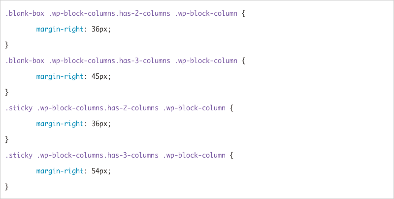
「2・3カラムはカラム表示」 のため、 カラム間マージンの記述が一気に増えます ;;
 /*_/_/_/_/_/_/_/_/*/
 /* iPhone   横向き  */
 /*        共通設定  */
 /*_/_/_/_/_/_/_/_/*/
 @media screen and
   (min-width: 568px) and
   (orientation: landscape)
 {
   $font_width: $thx_iphone_font_width;
   .page-body {
     font-size: $font_width;
   }

   /*  2・3カラムはカラム表示  */
   .wp-block-columns.has-2-columns,
   .wp-block-columns.has-3-columns {
     flex-wrap: nowrap;
 //    .wp-block-column {
 //      margin-left: 0px;
 //      margin-right: 0px;
 //    }
   }

   /*  案内ボックス  */
   .secondary-box {
     @include secondary-box($font_width);
   }

   /*  白抜きボックス  */
   .blank-box {
     @include blank-box($font_width);
   }

   /*  付箋風ボックス  */
   .blank-box.sticky {
     @include blank-box-sticky($font_width);
   }

   /*  アイコンボックス  */
   .common-icon-box {
     @include common-icon-box($font_width);
   }

   /*  トグルボックス  */
   .toggle-checkbox:checked~.toggle-content {
     @include toggle-checkbox($font_width)
   }
 }

 /*****************/
 /* iPhone  横向き  */
 /*       個別設定  */
 /*****************/
 @each $size in $iphone_sizes_l {
   $font_width: $thx_iphone_font_width;
   $contents_padding: $thx_main_column_contents_padding;
   // $contents_width を文字幅の整数倍に
   $contents_width:
     ($size - $contents_padding * 2)
     - (
       ($size - $contents_padding * 2)
       % $font_width
     )
   ;
   @media screen and
     (width: #{$size}px) and
     (orientation: landscape)
   {
     body {
       @include thx-beta-body;
     }
     p {
       @include thx-beta-p;
     }
     .no-scrollable-main .main {
       width: $contents_width + $contents_padding * 2;
       margin-left: auto;
       margin-right: auto;
       padding-left: $contents_padding;
       padding-right: $contents_padding;
     }
     //  カラムブロック間マージン設定
     @for $i from 2 through 3 {
       .wp-block-columns.has-#{$i}-columns{
         .wp-block-column{
           @include thx-column-margin(
             $contents_width,
             $font_width,
             $i,
             $thx_beta_column_margin
           );
         }
       }
     }
     //  案内ボックス
     .secondary-box {
       @include secondary-box($font_width);
       $columns_width:
         $contents_width - $font_width * 2
       ;
       @for $i from 2 through 3 {
         .wp-block-columns.has-#{$i}-columns{
           .wp-block-column{
             @include thx-column-margin(
               $columns_width,
               $font_width,
               $i,
               $thx_beta_column_margin
             );
           }
         }
       }
     }
     //  白抜きボックス
     .blank-box {
       @include blank-box($font_width);
       $columns_width:
         $contents_width - $font_width * 2
       ;
       @for $i from 2 through 3 {
         .wp-block-columns.has-#{$i}-columns{
           .wp-block-column{
             @include thx-column-margin(
               $columns_width,
               $font_width,
               $i,
               $thx_beta_column_margin
             );
           }
         }
       }
     }
     //  付箋風ボックス
     .blank-box.sticky {
       @include blank-box-sticky($font_width);
     }
     .sticky {
       $columns_width:
         $contents_width - $font_width * 4
       ;
       @for $i from 2 through 3 {
         .wp-block-columns.has-#{$i}-columns{
           .wp-block-column{
             @include thx-column-margin(
               $columns_width,
               $font_width,
               $i,
               $thx_beta_column_margin
             );
           }
         }
       }
     }
     //  アイコンボックス
     .common-icon-box {
       @include common-icon-box($font_width);
       $columns_width:
         $contents_width - $font_width * 5
       ;
       @for $i from 2 through 3 {
         .wp-block-columns.has-#{$i}-columns{
           .wp-block-column{
             @include thx-column-margin(
               $columns_width,
               $font_width,
               $i,
               $thx_beta_column_margin
             );
           }
         }
       }
     }
     //  トグルボックス
     .toggle-checkbox:checked~.toggle-content {
       @include toggle-checkbox($font_width)
     };
     .toggle-content {
       $columns_width:
         $contents_width - $font_width * 2
       ;
       @for $i from 2 through 3 {
         .wp-block-columns.has-#{$i}-columns{
           .wp-block-column{
             @include thx-column-margin(
               $columns_width,
               $font_width,
               $i,
               $thx_beta_column_margin
             );
           }
         }
       }
     }
   }
 }
iPad 縦向き
メディアクエリの内容は、 「iPhone 横向き」 の数値を変更する程度ですので、 ソースコードのみ記載します。
 /*_/_/_/_/_/_/_/*/
 /* iPad   縦向き  */
 /*      共通設定  */
 /*_/_/_/_/_/_/_/*/
 @media screen and
   (min-width: 768px) and
   (orientation: portrait)
 {
   $font_width: $thx_ipad_font_width;
   .page-body {
     font-size: $font_width;
   }
   .wp-block-columns.has-2-columns,
   .wp-block-columns.has-3-columns,
   .wp-block-columns.has-4-columns,
   .wp-block-columns.has-5-columns,
   .wp-block-columns.has-6-columns {
     flex-wrap: nowrap;
   }

   /*  案内ボックス  */
   .secondary-box {
     @include secondary-box($font_width);
   }

   /*  白抜きボックス  */
   .blank-box {
     @include blank-box($font_width);
   }

   /*  付箋風ボックス  */
   .blank-box.sticky {
     @include blank-box-sticky($font_width);
   }

   /*  アイコンボックス  */
   .common-icon-box {
     @include common-icon-box($font_width);
   }

   /*  トグルボックス  */
   .toggle-checkbox:checked~.toggle-content {
     @include toggle-checkbox($font_width)
   }
 }
 /***************/
 /* iPad  縦向き  */
 /*       個別設定  */
 /***************/
 @each $size in $ipad_sizes_p {
   @media screen and
     (width: #{$size}px) and
     (orientation: portrait)
   {
     $font_width: $thx_ipad_font_size;
     $contents_padding: 27px;
     // $contents_width を文字幅の整数倍に
     $contents_width:
       ($size - $contents_padding * 2)
       - (
         ($size - $contents_padding * 2)
         % $font_width
       )
     ;
     .page-body {
       font-size: $font_width;
     }
     body {
       @include thx-beta-body;
     }
     p {
       @include thx-beta-p;
     }
     .no-scrollable-main .main {
       width: $contents_width + $contents_padding * 2;
       margin-left: auto;
       margin-right: auto;
       padding-left: $contents_padding;
       padding-right: $contents_padding;
     }
     /*  4〜6カラムはカラム表示  */
     .wp-block-columns.has-4-columns,
     .wp-block-columns.has-5-columns,
     .wp-block-columns.has-6-columns {
       flex-wrap: nowrap;
       .wp-block-column{
         &:nth-child(odd) {
           padding-right: 0px;
         }
         &:nth-child(even) {
           padding-left: 0px;
         }
       }
     }
 //  カラムブロック間マージン設定
     @for $i from 2 through 6 {
       .wp-block-columns.has-#{$i}-columns{
         .wp-block-column{
           @include thx-column-margin(
             $contents_width,
             $font_width,
             $i,
             $thx_beta_column_margin
           );
         }
       }
     }
     //  案内ボックス
     .secondary-box {
       @include secondary-box($font_width);
       $columns_width:
         $contents_width - $font_width * 2
       ;
       @for $i from 2 through 6 {
         .wp-block-columns.has-#{$i}-columns{
           .wp-block-column{
             @include thx-column-margin(
               $columns_width,
               $font_width,
               $i,
               $thx_beta_column_margin
             );
           }
         }
       }
     }
     //  白抜きボックス
     .blank-box {
       @include blank-box($font_width);
       $columns_width:
         $contents_width - $font_width * 2
       ;
       @for $i from 2 through 6 {
         .wp-block-columns.has-#{$i}-columns{
           .wp-block-column{
             @include thx-column-margin(
               $columns_width,
               $font_width,
               $i,
               $thx_beta_column_margin
             );
           }
         }
       }
     }
     //  付箋風ボックス
     .blank-box.sticky {
       @include blank-box-sticky($font_width);
     }
     .sticky {
       $columns_width:
         $contents_width - $font_width * 4
       ;
       @for $i from 2 through 6 {
         .wp-block-columns.has-#{$i}-columns{
           .wp-block-column{
             @include thx-column-margin(
               $columns_width,
               $font_width,
               $i,
               $thx_beta_column_margin
             );
           }
         }
       }
     }
     //  アイコンボックス
     .common-icon-box {
       @include common-icon-box($font_width);
       $columns_width:
         $contents_width - $font_width * 5
       ;
       @for $i from 2 through 6 {
         .wp-block-columns.has-#{$i}-columns{
           .wp-block-column{
             @include thx-column-margin(
               $columns_width,
               $font_width,
               $i,
               $thx_beta_column_margin
             );
           }
         }
       }
     }
     //  トグルボックス
     .toggle-checkbox:checked~.toggle-content {
       @include toggle-checkbox($font_width)
     };
     .toggle-content {
       $columns_width:
         $contents_width - $font_width * 2
       ;
       @for $i from 2 through 6 {
         .wp-block-columns.has-#{$i}-columns{
           .wp-block-column{
             @include thx-column-margin(
               $columns_width,
               $font_width,
               $i,
               $thx_beta_column_margin
             );
           }
         }
       }
     }
   }
 }
iPad 横向き
サイドメニュー表示のため、 コンテンツ幅を 67% にしている程度です。 ソースコードのみ記載します。
 /*_/_/_/_/_/_/_/*/
 /* iPad   横向き  */
 /*      共通設定  */
 /*_/_/_/_/_/_/_/*/
 @media screen and
   (min-width: 1024px) and
   (orientation: landscape)
 {
   $font_width: $thx_ipad_font_width;
   .page-body {
     font-size: $font_width;
   }

   /*  案内ボックス  */
   .secondary-box {
     @include secondary-box($font_width);
   }

   /*  白抜きボックス  */
   .blank-box {
     @include blank-box($font_width);
   }

   /*  付箋風ボックス  */
   .blank-box.sticky {
     @include blank-box-sticky($font_width);
   }

   /*  アイコンボックス  */
   .common-icon-box {
     @include common-icon-box($font_width);
   }

   /*  トグルボックス  */
   .toggle-checkbox:checked~.toggle-content {
     @include toggle-checkbox($font_width)
   }
 }

 /***************/
 /* iPad  横向き  */
 /*       個別設定  */
 /***************/
 @each $size in $ipad_sizes_l {
   $font_width: $thx_ipad_font_size;
   $contents_padding: 30px;
   $contents_width: $size * 1px * 0.67 - $contents_padding * 2;

   // $contents_width を文字幅の整数倍に
   $contents_width:
     $contents_width
     - (
       $contents_width
       % $font_width
     )
   ;

   @media screen and
     (width: #{$size}px) and
     (orientation: landscape)
   {
     body {
       @include thx-beta-body;
     }
     p {
       @include thx-beta-p;
     }
     .no-scrollable-main .main {
       width: $contents_width + $contents_padding * 2;
       margin-left: auto;
       margin-right: auto;
       padding-left: $contents_padding - 1;
       padding-right: $contents_padding - 1;
     }
     //  カラムブロック間マージン設定
     @for $i from 2 through 6 {
       .wp-block-columns.has-#{$i}-columns{
         .wp-block-column{
           @include thx-column-margin(
             $contents_width,
             $font_width,
             $i,
             $thx_beta_column_margin
           );
         }
       }
     }
     //  案内ボックス
     .secondary-box {
       @include secondary-box($font_width);
       $columns_width:
         $contents_width - $font_width * 2
       ;
       @for $i from 2 through 6 {
         .wp-block-columns.has-#{$i}-columns{
           .wp-block-column{
             @include thx-column-margin(
               $columns_width,
               $font_width,
               $i,
               $thx_beta_column_margin
             );
           }
         }
       }
     }
     //  白抜きボックス
     .blank-box {
       @include blank-box($font_width);
       $columns_width:
         $contents_width - $font_width * 2
       ;
       @for $i from 2 through 6 {
         .wp-block-columns.has-#{$i}-columns{
           .wp-block-column{
             @include thx-column-margin(
               $columns_width,
               $font_width,
               $i,
               $thx_beta_column_margin
             );
           }
         }
       }
     }
     //  付箋風ボックス
     .blank-box.sticky {
       @include blank-box-sticky($font_width);
     }
     .sticky {
       $columns_width:
         $contents_width - $font_width * 4
       ;
       @for $i from 2 through 6 {
         .wp-block-columns.has-#{$i}-columns{
           .wp-block-column{
             @include thx-column-margin(
               $columns_width,
               $font_width,
               $i,
               $thx_beta_column_margin
             );
           }
         }
       }
     }
     //  アイコンボックス
     .common-icon-box {
       @include common-icon-box($font_width);
       $columns_width:
         $contents_width - $font_width * 5
       ;
       @for $i from 2 through 6 {
         .wp-block-columns.has-#{$i}-columns{
           .wp-block-column{
             @include thx-column-margin(
               $columns_width,
               $font_width,
               $i,
               $thx_beta_column_margin
             );
           }
         }
       }
     }
     //  トグルボックス
     .toggle-checkbox:checked~.toggle-content {
       @include toggle-checkbox($font_width)
     };
     .toggle-content {
       $columns_width:
         $contents_width - $font_width * 2
       ;
       @for $i from 2 through 6 {
         .wp-block-columns.has-#{$i}-columns{
           .wp-block-column{
             @include thx-column-margin(
               $columns_width,
               $font_width,
               $i,
               $thx_beta_column_margin
             );
           }
         }
       }
     }
   }
 }
まとめ
、、、 ん〜、 ゴリゴリですね w
固定サイズを増やしたため、 コードが増加するのは分かってはいたのですが、 現在ベタ組みのみの css で 1,500 行オーバーです、、、 38,000 文字、 38.6KB にもなります、、、
今後の課題
まずはコードの削減ですね。 AMP の 50KB 制限も視野に入れると全然ダメダメっす。 何 KB ならいいのか?ってのはワカランのですが、 出来るだけ削減したいです。
あと、 scss の記述もコンパクトにしたいですね。 css のサイズへの直接的影響は少ないと思うのですが、 似通った記述が多いため変更時のメンテナンス性が酷くて醜くって見難いです。
コメント